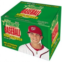
2012 Topps Heritage High-Number Set
This is the first year I can recall that Topps brought out a high-number (or update) set for its annual Heritage issue. The good news here is that Topps has listened to its customers and issued this long sought after prize. I was especially excited when I learned of its existence because the 1963 Topps is my favorite set. So you can imagine my dismay when this clunker arrived with a resounding thud in my mailbox last week.
It’s the ugliest collection of cards I’ve ever seen. Never did I dare to imagine that Tops would, or even could, sink this low. They either don’t care about us, their customers, or they no longer have any pride in their own product, because this is pathetic.
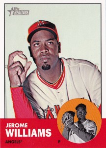
 Airbrushing is the first culprit. Why in this day and age is it even used? Isn’t there time enough to do this right, with real caps and uniforms? Any photographer can attach countless photographs to emails and send them to Topps, which would receive them within minutes. If there is any concern that the quality of an email attached image might not be sharp enough, then Fed Ex next day service can be used. The extent that airbrushing was used in this set is completely unnecessary. Just look at the cap that Jerome Williams is wearing on this card, #H607 from the one-hundred card set. Does that baseball cap look right to you? It sure doesn’t look right to me. If only a few of the cards were airbrushed, I wouldn’t like it, but I would be more understanding. But this is outrageous. I’ve reviewed the set several times, and to me, it appears that about 90 of the cards have been given this woefully inadequate treatment.
Opaque, dull backgrounds take second place on my list of complaints. I refer you once again to the Jerome Williams card; look at that white, lifeless background. Back in the mid-1980’s I put a 1963 Topps set together. Whenever I look at it, I am just amazed at the combination of gorgeous colors from the card’s design combined with varying backgrounds, whether they be of Yankee Stadium, the Polo Grounds, shots of fans in the background, green lawns, batting cages and ball fields. It’s stunning. By way of contrast, here’s this year’s stinker. There are roughly 30 cards that have varying “shades” of the same colorless background, ranging from light tan, light gray, dark grey to pale blue, which might be Topps’ idea of the sky, and if it is, I’m not deceived.
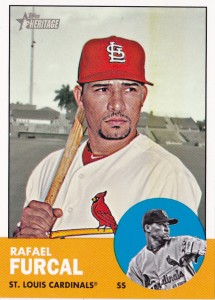
 Third among my list of complaints is the black and white treatment given to the backgrounds that do appear. Rafael Furcal’s #H661 card is a prime example. Even on a cloudy day, palm trees are green and background objects have color. If the backgrounds were muted to emphasize the players, caps and jerseys, it’s a mistake that brings attention to the poor treatment they received.
I asked my friend Mark, a fellow baseball card collector and fellow blogger, for his opinion of these very cards, and he agrees with many, but not necessarily all, of my contentions. When he said “it sometimes becomes very apparent that Topps thinks very little of us. Furthermore, if Topps can’t reproduce or represent their own vintage product or design to a T, then who could?” He sure sounded like he was in complete agreement with me when he made those two comments. However, in his next breath Mark added “I really love the Heritage product, and the High Number Set was eagerly received by yours truly. I just like the feel of the Heritage cards and the vintage aura they (attempt to) capture.”
I have to confess I agree with you there, Mark. I have to give Topps high marks for thinking of this issue, even if I deplore the finished product. I’ll grudgingly admit I like the feel of the paper stock. Topps also did a nice job on the backs of the cards where they correctly conveyed the innocence of the era with the sweet nature of the cartoons that appear there.
But it’s not enough and I’m not alone. I also reached out to another baseball card friend, a woman who knows her way around a baseball card since she’s been looking at them and collecting cards of her favorite players for decades. “These cards look like they were cut and pasted together, which truly is an insult,” she opined. “There is no flavor of the stadium, the plate, the team identity, town or anything. (They are) truly a slap in the face for the players, teams, legacy of the game and most importantly, for the fans who hold the players, teams, and of course, baseball cards close to their hearts.” Wow, Nancy, well said.
So there you have it. We’ve been given visually unappealing cards with painted over or faded gray backgrounds and horribly air-brushed caps that wouldn’t fool a blind person. The 2012 Topps Heritage High-Number Set is an inconsiderate, sloppily executed product that pays little heed to the beauty of the original issue from which it’s based and ostensibly represents.


Topps has done a high number / update series for Heritage before. In the past, they marketed it with regular Topps Update cards included in the pack so they didn’t have to claim it as a separate set towards the total they were allowed to produce for the year.
I don’t think anyone is left at Topps who actually has the skills to produce baseball cards the way that they actually did before everything went digital – between that, and the difference in manufacturing technology, it’s only natural that the cards seem slightly off when compared to the vintage originals.
I’m not thrilled with the $100 100-card set idea, but I don’t really think it’s that unfriendly to the set collectors who really tried to build the whole thing – how much would it cost to chase down the shortprints if Topps had gone with a more traditional release?
I sort of agree with you – just not quite to the extent. I wasn’t excited about the price tag, but I was excited about the idea. While the pictures weren’t their greatest effort, I guess it doesn’t bother me that much. The biggest issue for me is they screwed up the numbering. The base set ends at 500… yet this starts at 576. The things you’re pointing out, while true, are at least subjective. Numbering it wrong – that’s just plain screwing up.
The problem is they do care about customers – but only one kind. The autograph opportunity for guys like Harper, Cespedes, Darvish and Middlebrooks is as much of what they’re selling as anything. Which is sad because they’re doing it in a product that’s typically geared toward set collector’s – so it’s a money grab.
Still – I was excited to get the set. Plus, I pulled a Pettitte auto and actually turned a profit!